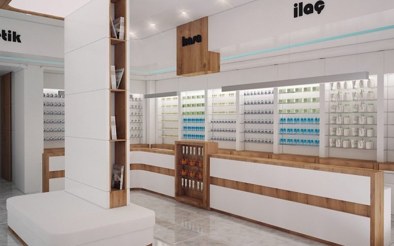
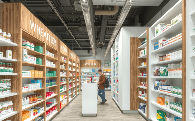
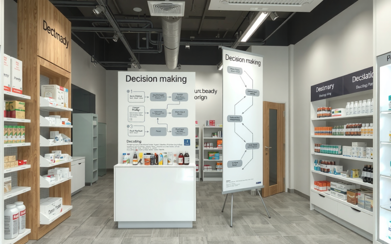
Introduction: Why Your Pharmacy Layout is Your Most Underrated Asset
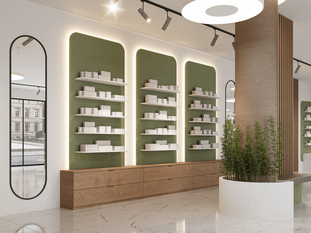
Your pharmacy layout is more than just a floor plan. It is a powerful tool that shapes your business success. A smart layout helps your staff work better. It makes patients happier. It also boosts your profits. Many owners focus on marketing or inventory. But they often overlook the physical space itself. A thoughtful pharmacy layout design is a smart investment in your future.
Key Takeaways
- A well-designed pharmacy layout increases sales. It improves patient flow and product visibility.
- Workflow efficiency is critical. A good layout reduces staff steps and errors. It speeds up prescription fulfillment.
- The three main layout types are Grid, Free-Flow, and Hybrid. The best choice depends on your space and business model.
- Strategic zoning creates special areas. These include consultations, quick pickups, and high-margin retail.
- ADA regulations are required. You must include them in your initial design.
The High Cost of a Poor Layout
A poor pharmacy layout creates daily problems. It can cause bottlenecks at the counter. Staff become stressed. Patients get frustrated. It can also hide your most profitable retail products. This leads to lost sales every day. These small issues add up to big financial costs over time.
The Triple Win
A strategic design creates a triple win. Patients get a comfortable and easy experience. Your staff gets an efficient workspace. This reduces stress and errors. Your business gets increased sales and higher profits. This makes investing in your pharmacy layout one of the smartest decisions you can make.
What You’ll Learn
This guide is your roadmap to a future-proof pharmacy layout. We will cover the core principles of effective design. We will compare different layout models. We will walk through the patient and staff journey step-by-step. We will provide actionable furniture design ideas. You will learn how to create a pharmacy that is efficient, profitable, and ready for the future.
The Core Principles: Balancing Patient Care, Workflow, and Retail Success
An effective pharmacy layout is built on three core principles. These basics work together to create a space that serves everyone. Understanding them is the first step toward a successful design project. Every decision should support these goals. This includes where you place a shelf or the width of an aisle.
Principle 1: Patient-Centricity and Experience
Your design must put the patient first. This means creating a welcoming atmosphere. Clear signs help patients find what they need. Providing privacy for consultations is essential for building trust. The entire pharmacy layout should feel safe and accessible to every person who walks through your door.
Principle 2: Operational and Workflow Efficiency
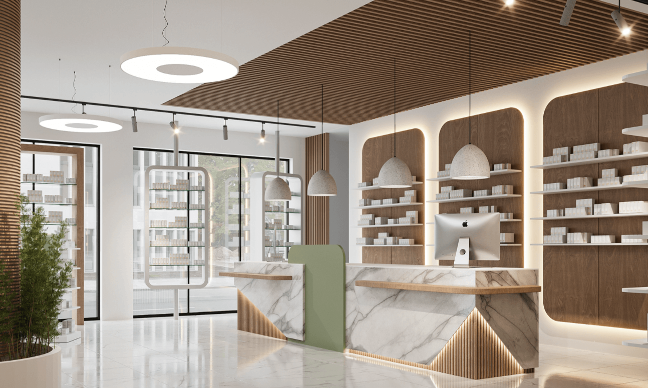
Your team’s workflow is the engine of your pharmacy. A good layout reduces the number of steps staff take to fill a prescription. This is a core part of the fundamental objectives of pharmacy layout design. When the dispensing process is smooth, efficiency goes up. Prescription wait times go down. The risk of errors is reduced. This creates a less stressful work environment and a better experience for patients.
Principle 3: Retail Optimization and Profitability
The front-end of your store is a major profit center. Your pharmacy layout should encourage customers to browse while they wait. Smart product placement can guide patients toward high-margin items. These include vitamins, supplements, and personal care products. By making your retail offerings more visible, you can increase the average transaction value.
Decoding Pharmacy Layout Types: Which Model is Right for You?
There is no single “best” pharmacy layout. The right choice depends on your store’s size and your business goals. It also depends on the type of experience you want to create. We will explore the three most common layout models. This will help you decide which one fits your pharmacy’s unique needs.
The Traditional Grid Layout
The grid layout is the most common design. It is especially popular in larger stores. It features long, parallel aisles of shelving. This is similar to a traditional grocery store. This layout maximizes the amount of product you can display.
This design is excellent for high-volume pharmacies. It works well with a large front-end retail section. It creates a familiar shopping experience. It makes it easy for staff to restock shelves. However, it can feel rigid. It may not encourage leisurely browsing.
The Modern Free-Flow Layout
A free-flow layout is more open and less structured. It uses curved aisles and creative fixture placements. This creates a more relaxed, boutique-like atmosphere. This design encourages exploration and discovery.
This model is a great choice for smaller pharmacies. It also works for those with a strong focus on wellness and personalized service. It feels more modern and less clinical. The main drawback is that it is less space-efficient for displaying a large volume of products.
The Hybrid or Loop Layout
The hybrid model is often called a loop layout. It combines elements of both the grid and free-flow designs. It typically features a main circular path that guides customers through the entire store. As noted in this essential guide to retail pharmacy layouts, this path acts as an “anchor.” It exposes customers to various departments and key product displays.
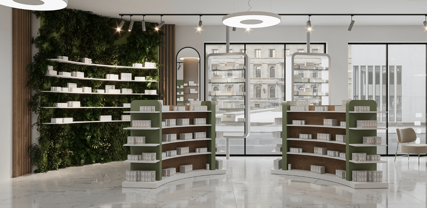
This is a versatile option. It balances efficient traffic flow with the opportunity for product discovery. It works well for mid-sized pharmacies. These want to highlight specific departments like beauty or medical equipment. It still guides patients efficiently to the pharmacy counter in the back.
Layout Comparison Matrix
To make the choice clearer, we’ve compared the three main pharmacy layout types across key factors.
| Feature | Grid Layout | Free-Flow Layout | Hybrid/Loop Layout |
|---|---|---|---|
| Space Utilization | Very High | Lower | Moderate to High |
| Staff Workflow | Efficient & Simple | Can be complex | Structured & Efficient |
| Customer Browsing | Structured, less discovery | High, encourages discovery | Guided, high exposure |
| ADA Accessibility | Easy to implement | Requires careful planning | Generally good |
| Initial Cost | Lower | Moderate | Moderate to High |
The Patient & Staff Journey: A Step-by-Step Workflow Design
To design a truly effective pharmacy layout, you must think about two perspectives. These are the patient’s and the staff’s. Let’s walk through a typical visit. We’ll see how design choices impact every stage of the journey. A great layout makes this entire process smooth and seamless.
Stage 1: Entry & Triage (The First Impression)
Imagine a patient with a new prescription enters your pharmacy. What do they see first? The entrance area should be open and uncluttered. Clear, professional signs must direct them to the prescription drop-off area.
If there is a queue, a well-designed waiting area with comfortable seating makes a positive impression. Private intake windows protect patient privacy from the very beginning. This first interaction sets the tone for the entire visit.
Stage 2: Waiting & Browsing (The Retail Opportunity)
The waiting period is your prime retail opportunity. The path from the entrance to the waiting area should pass by well-merchandised displays. Place high-margin over-the-counter products along this path. These include vitamins, supplements, or seasonal allergy relief.
Comfortable seating is a must. Arrange it to face retail displays, not just a blank wall. This simple furniture design idea encourages browsing. It turns wait time into shopping time.
Stage 3: Consultation & Privacy (Building Trust)

Patient trust is built on privacy. Modern pharmacies need dedicated spaces for consultations and immunizations. They also need spaces for MTM services. This can be a semi-private alcove or a fully enclosed room.
The design of this space is critical. It should be quiet, professional, and comfortable. The overall pharmacy design must communicate confidentiality and care. This makes patients feel secure when discussing sensitive health information. This is a key part of evolving from a simple dispensary to a healthcare destination.
Stage 4: Dispensing & Pickup (The Core Function)
This is the heart of your operation. The dispensing area must be designed for maximum efficiency and accuracy. A U-shaped or C-shaped workflow is often best. This reduces the steps staff take between workstations, drug storage, and the verification area.
The pharmacy counter is the central point of this zone. Its design should allow for clear, easy interaction between the pharmacist and the patient. It needs adequate space for point-of-sale systems, patient paperwork, and the medications themselves. A well-designed pharmacy layout ensures this core function runs like a well-oiled machine.
Stage 5: Checkout & Exit (The Final Touchpoint)
The final step is checkout and exit. If your pharmacy has a separate front-end checkout, its location is important. Position it near the exit. But do it in a way that doesn’t create congestion.
This is also the last chance for an impulse purchase. Small, high-demand items should be displayed at the checkout counter. These include hand sanitizer, lip balm, or healthy snacks. A friendly farewell and an easy exit complete a positive patient journey.
Strategic Zoning & Furniture Design Ideas for the Modern Pharmacy
A modern pharmacy is more than just a place to pick up prescriptions. It’s a health and wellness hub. A smart pharmacy layout uses strategic zoning to create distinct areas. These serve different patient needs. This approach, supported by the right furniture, can transform your space and your business.
Beyond the Counter: Creating Specialized Zones
Think of your pharmacy as a collection of zones. Each has a specific purpose. This makes your store easier to navigate. It also adds value to the customer experience.
- The Wellness & Consultation Zone: This area is for services like vaccinations and health screenings. It also handles private consultations. It needs privacy and a professional feel.
- The Quick Pickup Zone: Create a dedicated spot for patients who have pre-paid or called in refills. Mark it clearly. This improves flow and satisfies customers in a hurry.
- The High-Value Retail Zone: Use premium lighting and displays to showcase products. These include high-end skincare, vitamins, or specialty health foods. Effective medicine shop interior design in this zone can make products feel more valuable and appealing. This drives higher sales.
Essential Pharmacy Furniture: Function Meets Form
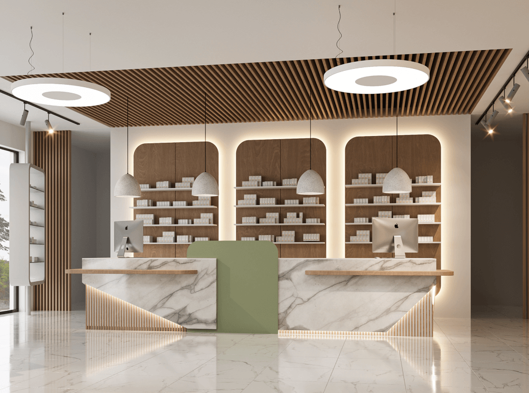
The right furniture is crucial for bringing your pharmacy layout to life. It must be durable, functional, and aligned with your brand’s look. Investing in quality pharmacy furniture ensures your design is built to last.
- Dispensary & Counter Area: The design of the main pharmacy counter and workstations must be ergonomic. This reduces staff fatigue and improves workflow.
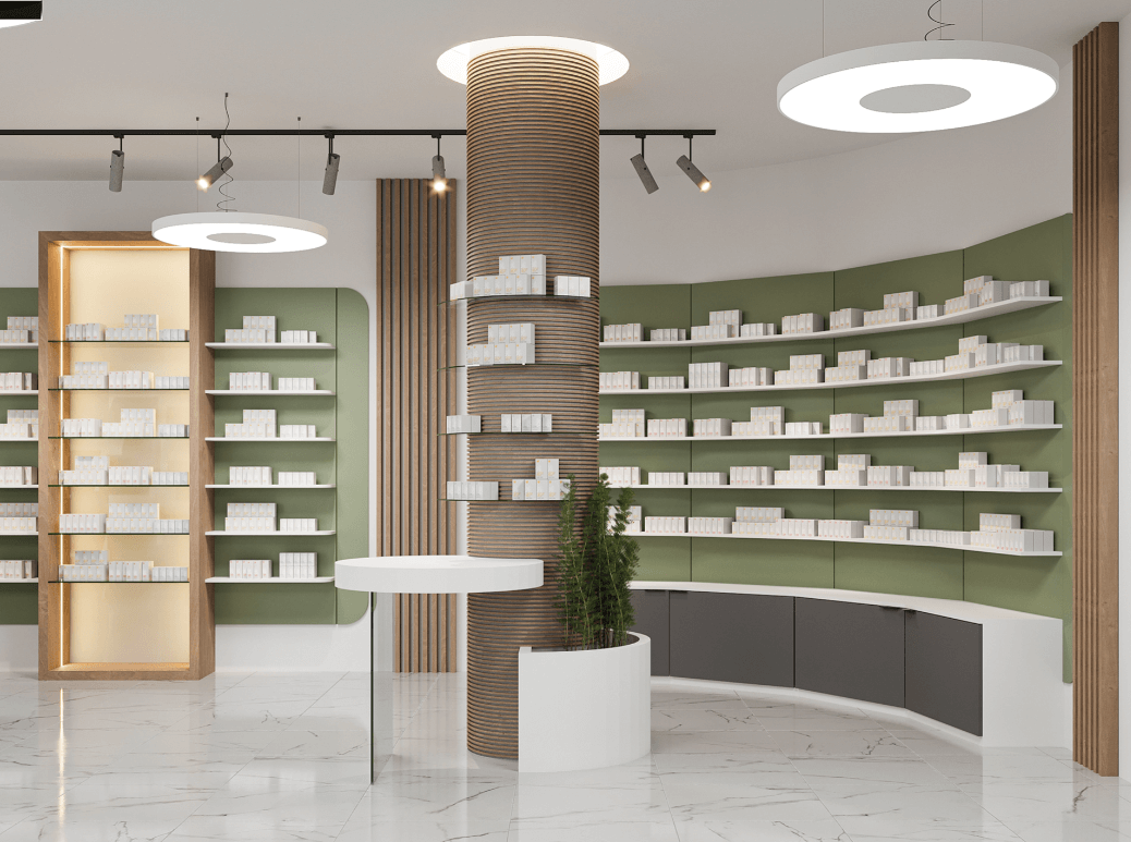
- Shelving Systems: A flexible pharmacy wall shelf is essential. Use it for both behind-the-counter prescription storage and for retail displays in the front of the store. Modular systems allow you to adapt as your needs change.
- Gondolas and End Caps: These freestanding units are the workhorses of your retail floor. Use them to create aisles. Place them strategically to highlight promotions and high-margin products.
- Display Cabinets: A secure and well-lit medicine display cabinet is perfect for high-value items. It also works for controlled substances or fragile products. Glass doors and internal lighting draw attention while maintaining security.
- Waiting Area Seating: Choose chairs and benches that are comfortable, durable, and easy to clean. Arrange them to facilitate both privacy and social distancing.
Critical Considerations: Compliance, Technology, and Accessibility
A beautiful and efficient pharmacy layout is useless if it’s not compliant, safe, and ready for the future. These technical considerations are non-negotiable. They must be part of your planning from day one. Getting these details right protects your business and your patients.
Navigating Regulatory & ADA Compliance
Your pharmacy must comply with all local, state, and federal regulations. This includes the Americans with Disabilities Act (ADA). According to essential guidelines for optimizing space and ensuring accessibility, this has specific design implications.
For example, ADA requires main aisles to be at least 36 inches wide. This allows for single wheelchair passage. However, providing 42 to 48 inches is better for comfort. You must also include 60-inch diameter turning circles in key areas. Service counters where patients receive items should have a section that is between 28 and 34 inches high.
Integrating Technology: Automation and Digital Displays
Technology is changing pharmacy practice. If you plan to use a robotic dispensing system, you must allocate sufficient space for the machine and its maintenance. The location should be integrated directly into the dispensing workflow. This maximizes its efficiency.
Digital signage is another powerful tool. Use screens to display health information, promote services, or manage patient queues. Planning for power and data ports during the design phase is much cheaper than adding them later.
Lighting and Security by Design
A good lighting plan uses multiple layers. Task lighting is needed in the dispensary for accuracy. Ambient lighting creates a welcoming atmosphere in the retail area. Accent lighting can highlight key products or architectural features.
Security should also be designed into the pharmacy layout. Strategic camera placement can cover all critical areas. This includes the entrance, cash registers, and the pharmacy department. Secure storage for controlled substances must meet regulatory standards. It should be integrated seamlessly into the dispensary design.
Bringing It All Together: Partnering with a Pharmacy Design Expert
Translating a great pharmacy layout from paper to reality is a complex task. It requires a deep understanding of workflow, materials, regulations, and construction. This is where a professional partner becomes invaluable.
Working with a specialized pharmacy design company ensures that every detail is optimized for your specific needs. An experienced partner like Ouyee Display can guide you through the entire process. This goes from initial concept to manufacturing and final installation. They help you navigate the complexities. They ensure your vision is executed perfectly. This delivers a space that supports your business goals for years to come.
Frequently Asked Questions (FAQ) about Pharmacy Layout
Q1: What is the most important rule in pharmacy layout design?
A: The most widely accepted rule is to place the prescription dispensing counter at the back of the store. This acts as an anchor. It draws patients through the retail section. This maximizes their exposure to front-end products, which can significantly increase sales.
Q2: What is the best layout for a very small pharmacy?
A: For small pharmacies, a free-flow layout is often best. It creates a more open, less cluttered feel. It allows for flexibility. Combining this with smart furniture choices is key. Use a vertical pharmacy wall shelf to maximize storage. Use compact, multi-functional counters to make the most of a limited footprint.
Q3: How wide should the aisles be in a pharmacy?
A: Aisles must be compliant with the Americans with Disabilities Act (ADA). This generally means a minimum width of 36 inches (91.4 cm) for a straight path. But providing 42-48 inches is better for comfort. A 60-inch (152.4 cm) diameter turning circle is also required in key areas.
Q4: How can I improve workflow in my existing pharmacy layout?
A: Start by mapping the journey of a prescription from drop-off to pickup. Identify bottlenecks and areas where staff take unnecessary steps. Sometimes, simply reorganizing workstations can help. Optimize the placement of fast-moving drugs. Create a dedicated “quick pickup” spot. This can dramatically improve efficiency without a full renovation.
Q5: Where should I place high-margin OTC products?
A: Place them in high-traffic areas. The best spots are on end caps (the ends of aisles). Also use the “decompression zone” just inside the entrance. Place them along the path to the pharmacy counter. Use the checkout counter for impulse buys.


